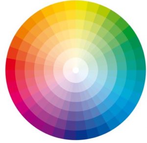
Using a colour wheel will help you make the most of your favourite colours
What is Colour Pairing? When designing a room and tying together elements of a space, there has to be a common thread within the colours. They have to tie in together and gel, otherwise there is a dysfunctional relationship with the space and the senses. That’s where colour pairing comes in!
How do you integrate colour pairing into our designs? Firstly, hire the Home Stylist! But if that doesn’t work for you, buy a colour wheel. Your instinct will often tell you whether the colours work well together or not but having a wheel to reference really does help. One of my favourite colour pairings is Pink and Brows. Sounds awful doesn’t it? But they truly look lovely together! A colour wheel can help you see that from the get go.
Should we all have a colour wheel? Yes! They come in all sizes, easy to carry around and if you have a good one it will explain how to use it. Personally, I have about 3.
When deciding on what colour palette to either decorate a room with or what fabric we’re going to use to cover a piece of furniture (setting the tone of a room) it’s important to know which colours will help you achieve the look and feel that you’re after. Firstly I would start with the concept words: what are you trying to achieve? Find 3 -5 words that will describe the room you’re decorating. Let’s, for example decorate a bedroom, how do we want that to feel? I would suggest the concept words here should be:
Calm
Comfort
Serenity
Harmony
What colour palette makes you feel this way? Is it the blue, red or yellow, our primary colours (these colours cannot be mixed using any other colours)? Or the secondary colours, green, orange or purple (These colours are made my mixing the primary colours in different combinations)? This will help you achieve your concept.
To create the harmonious concept we want soft hues, calming tones a neutral palette and maybe a little pop of something.
Let’s for example go with a Blue – Green as our starting point. These are neutral calming colours. A very pale Blue – Green will come out as a soft grey. If we paint the walls in this colour (not the ceiling or the architraves, we’ll leave those white to make the colour pop) we can then build and colour pair, from that base layer.
Walls: Here we have chosen a soft Green/Blue which is obviously made much softer due to the amount of white added to the grey wall.

Fabrics: This background colour is deeper than the walls, adding a contrast with a pop of red, which is a complimentary colour to the Blue/Green. You’ll see this on the colour wheel.
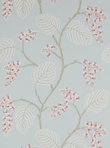
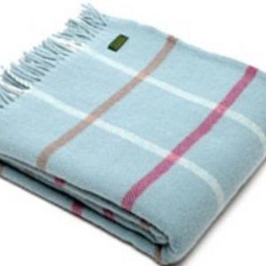
Soft furnishings: We’re changing the colour up here again and bringing the colours a bit more, there are again the complimentary colours on the colour wheel
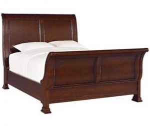
Furniture: For the furniture we’ve bought in a natural wood, this really adds a contrast which ties everything together and work well with primary and secondary colours.
Art: With the art we can combine all the colours together, as long as we a fulfilling all our concept words.

Remember:
Neutrals are not boring! They bring colours together, they act as the link.
Want a professional touch with your next styling project? Call The Home Stylist Today for a quote! http://bit.ly/TheHomeStylist

