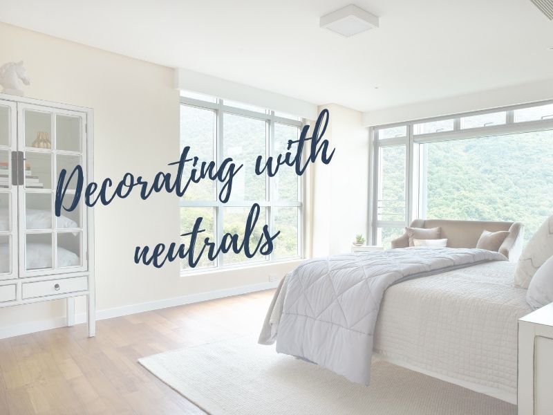
After months of talking non stop about bold pattern and pops of colour as top styling trends for 2019, we’re flipping the switch to talk about decorating with neutral colours.
There are so many fabulous colours making a statement in home styling today, but this doesn’t mean you can’t have fun decorating with neutrals too! Don’t be fooled, we’re still huge fans of the dusty pinks, vibrant corals, and emerald greens, but there is a lot you can do in your home with neutral colours.
So, what are neutral colours?
What do we clarify as neutral? The easiest way to define neutral colours in interior design are those ‘without colour’. Think white, beige, grey, and taupe.
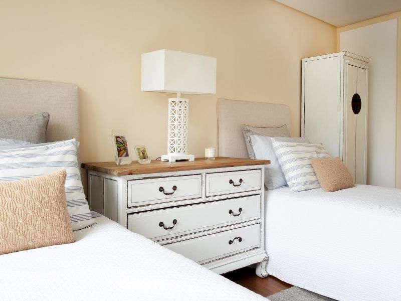
In reality, these neutral colours used in home styling always have an underlying hue and tone to them. Typically, no one ever styles with pure white, pure black or pure grey! The undertone of your neutral colour will determine where you use it, the overall feel of your colour palette and which pops of colour you use with it.
For example, if you were choosing a neutral colour for a bedroom you could choose a warmer tone, with underlying hues of yellow and red, while you could use a cooler, bluish neutral for a bathroom.
So, why use neutral colours in your home?
Neutral colours allow for endless possibilities when it comes to home styling.
This is especially true with wall colours. Painting all your walls in one solid colour can make a bold statement but it also limits you with how you then style the rest of your decor.
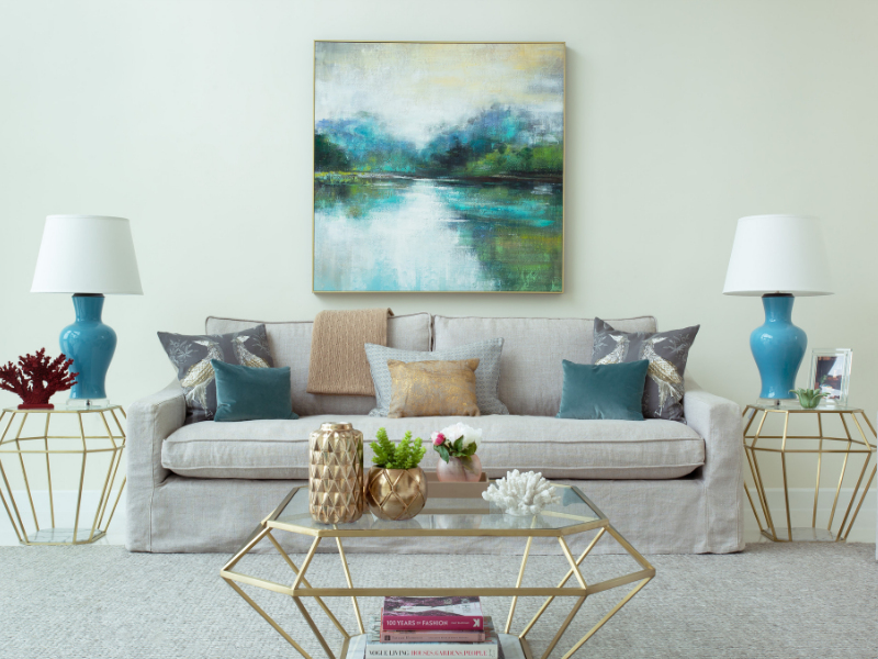
With a base of neutral tones in your walls, flooring and furniture, you can add pops of colour in so many different ways. You can combine colours and patterns, draw attention to specific items or the view outside, and you can easily mix things up if you are someone who likes change. If the home styling trends change or your tastes change, you can easily swap out your ‘popping’ colour without restyling everything.
Read our full post on styling ‘boring’ white walls here.
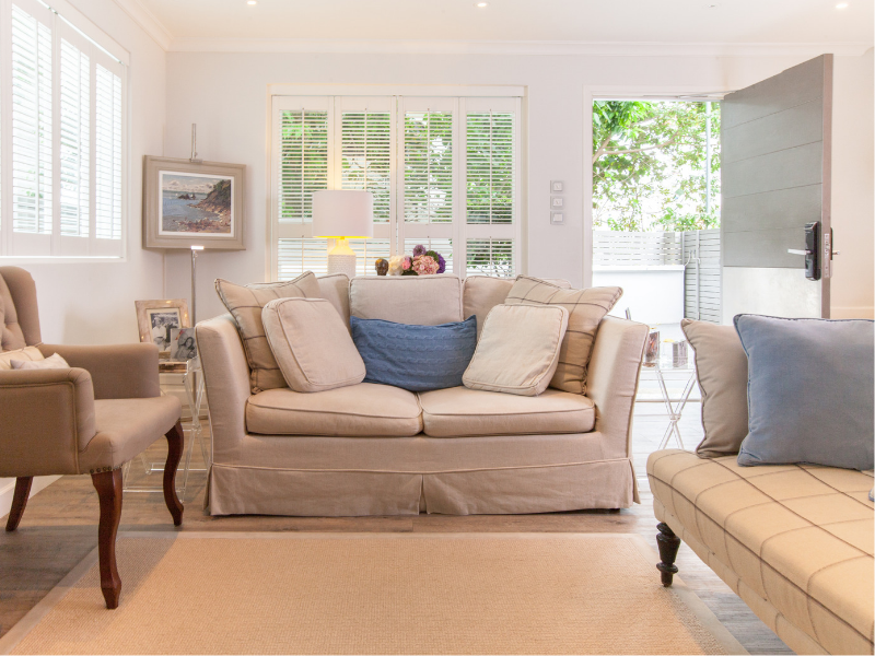
Decorating with neutrals also provides an opportunity to style with texture.
Texture adds depth, luxury and variety to your room and is really important for the overall feel of the space. Shiny, smooth textures will make a place feel modern, while softer, natural textures will help add warmth to a room. Materials that are naturally quite neutral, like wood and wool, will add their own ‘texture pop’ in a room styled with neutral colours.
The textures you choose help to define your style just as much as your colour palette. Many people think that decorating with neutrals means opting for a minimalist, modern home. But neutrals work with all kinds of styles! You can include as much furniture, soft furnishings, flowers and decor as you like if most of these items are based on neutral colours.
Do you need neutrals in your home?
We suggest sticking to neutrals if…
If you are decorating a small space, then you will really benefit from neutral colours. We often recommend to our clients with apartments and small rooms to keep their large pieces of furniture neutral. This way, they appear to take up less visual space and therefore keep the room from feeling too cramped.
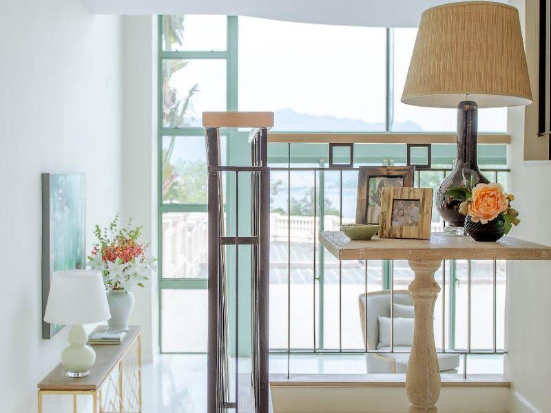
If your home is built with interesting architectural details, like vaulted ceilings or natural wooden beams, then neutral colours can help these stand out. These kinds of structural features should be left to tell their own story!
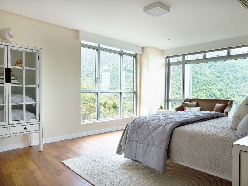
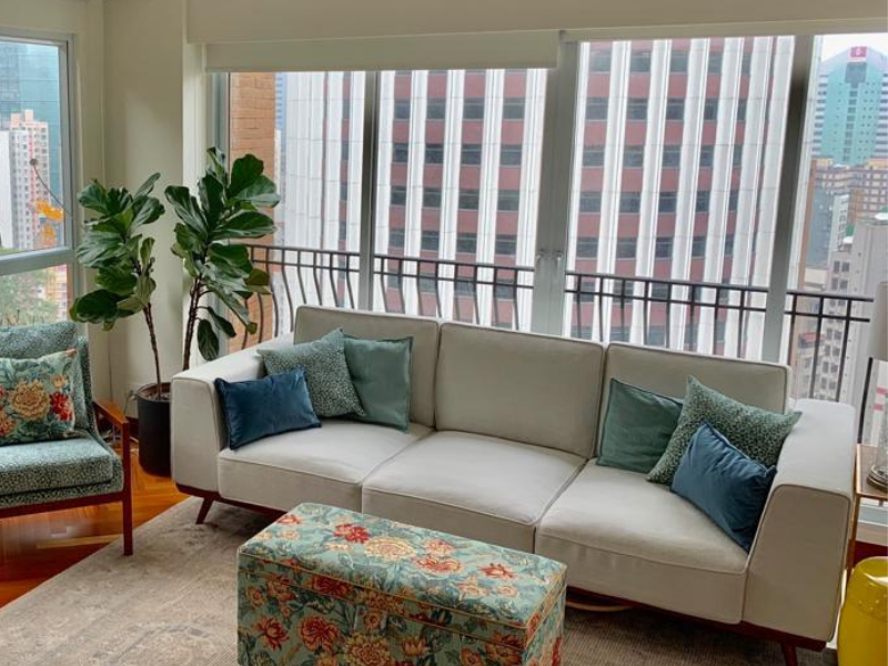
If you have a great vista from your window, then keep your walls neutral. This will draw your eye to the outside and that great view. In the same vein, build your colour palette around neutrals with a green tone if you have a green view and if you have a great sea view, include neutrals with a blue tone.
Finally, let’s talk about the home styling unicorn in the room: a neutral pop of colour!
Yep, there is one special neutral colour that works beautifully as a popping colour and that is black. Black can be a daunting colour to style with, but used in small doses in smart ways it can be really striking. Just think about how beautiful black beams on a traditional Tudor house look.
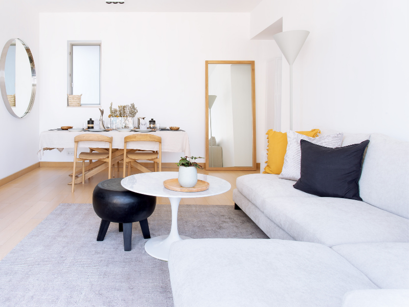
Black works well as an accent colour in frames, furniture and as one of multiple colours in patterned rugs, cushions, throws and curtains.
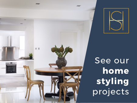
All images used in this blog on decorating with neutral colours are rooms and homes styled by our fabulous stylists.
If you’d like to book a chat with one of them – online with a virtual styling session or face to face in Hong Kong or England – then get in touch today.